Download this notebook from github.
Statistical Downscaling and Bias-Adjustment
xclim provides tools and utilities to ease the bias-adjustement process through its xclim.sdba module. Almost all adjustment algorithms conform to the train - adjust scheme, formalized within TrainAdjust classes. Given a reference time series (ref), historical simulations (hist) and simulations to be adjusted (sim), any bias-adjustment method would be applied by first estimating the adjustment factors between the historical simulation and the observations series, and then
applying these factors to sim, which could be a future simulation.
This presents examples, while a bit more info and the API are given on this page.
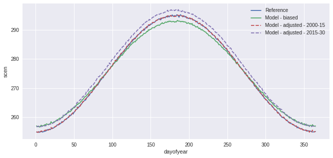
A very simple “Quantile Mapping” approach is available through the “Empirical Quantile Mapping” object. The object is created through the .train method of the class, and the simulation is adjusted with .adjust.
[1]:
import cftime
import matplotlib.pyplot as plt
import numpy as np
import xarray as xr
%matplotlib inline
plt.style.use("seaborn")
plt.rcParams["figure.figsize"] = (11, 5)
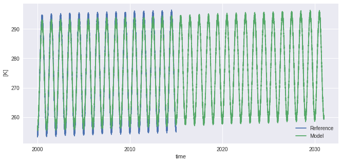
# Create toy data to explore bias adjustment, here fake temperature timeseries
t = xr.cftime_range("2000-01-01", "2030-12-31", freq="D", calendar="noleap")
ref = xr.DataArray(
(
-20 * np.cos(2 * np.pi * t.dayofyear / 365)
+ 2 * np.random.random_sample((t.size,))
+ 273.15
+ 0.1 * (t - t[0]).days / 365
), # "warming" of 1K per decade,
dims=("time",),
coords={"time": t},
attrs={"units": "K"},
)
sim = xr.DataArray(
(
-18 * np.cos(2 * np.pi * t.dayofyear / 365)
+ 2 * np.random.random_sample((t.size,))
+ 273.15
+ 0.11 * (t - t[0]).days / 365
), # "warming" of 1.1K per decade
dims=("time",),
coords={"time": t},
attrs={"units": "K"},
)
ref = ref.sel(time=slice(None, "2015-01-01"))
hist = sim.sel(time=slice(None, "2015-01-01"))
ref.plot(label="Reference")
sim.plot(label="Model")
plt.legend()
[1]:
<matplotlib.legend.Legend at 0x7feecfd04c40>
[2]:
from xclim import sdba

QM = sdba.EmpiricalQuantileMapping.train(
    ref, hist, nquantiles=15, group="time", kind="+"
)
scen = QM.adjust(sim, extrapolation="constant", interp="nearest")

ref.groupby("time.dayofyear").mean().plot(label="Reference")
hist.groupby("time.dayofyear").mean().plot(label="Model - biased")
scen.sel(time=slice("2000", "2015")).groupby("time.dayofyear").mean().plot(
    label="Model - adjusted - 2000-15", linestyle="--"
)
scen.sel(time=slice("2015", "2030")).groupby("time.dayofyear").mean().plot(
    label="Model - adjusted - 2015-30", linestyle="--"
)
plt.legend()
[2]:
<matplotlib.legend.Legend at 0x7feebecb8b20>

In the previous example, a simple Quantile Mapping algorithm was used with 15 quantiles and one group of values. The model performs well, but our toy data is also quite smooth and well-behaved so this is not surprising. A more complex example could have biais distribution varying strongly across months. To perform the adjustment with different factors for each months, one can pass group='time.month'. Moreover, to reduce the risk of sharp change in the adjustment at the interface of the
months, interp='linear' can be passed to adjust and the adjustment factors will be interpolated linearly. Ex: the factors for the 1st of May will be the average of those for april and those for may.
[3]:
QM_mo = sdba.EmpiricalQuantileMapping.train(
    ref, hist, nquantiles=15, group="time.month", kind="+"
)
scen = QM_mo.adjust(sim, extrapolation="constant", interp="linear")

ref.groupby("time.dayofyear").mean().plot(label="Reference")
hist.groupby("time.dayofyear").mean().plot(label="Model - biased")
scen.sel(time=slice("2000", "2015")).groupby("time.dayofyear").mean().plot(
    label="Model - adjusted - 2000-15", linestyle="--"
)
scen.sel(time=slice("2015", "2030")).groupby("time.dayofyear").mean().plot(
    label="Model - adjusted - 2015-30", linestyle="--"
)
plt.legend()
[3]:
<matplotlib.legend.Legend at 0x7feebf0f9550>
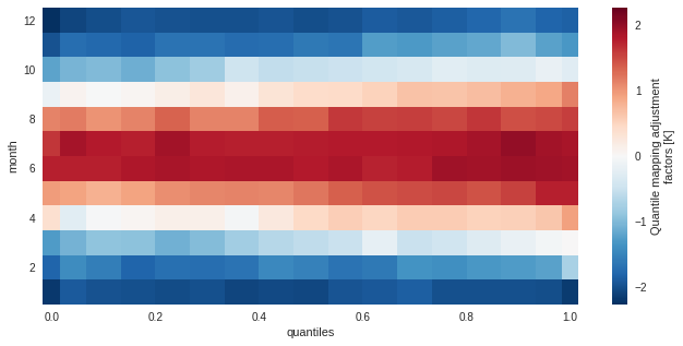
The training data (here the adjustment factors) is available for inspection in the ds attribute of the adjustment object.
[4]:
QM_mo.ds
[4]:
<xarray.Dataset>
Dimensions:    (quantiles: 17, month: 12)
Coordinates:
  * quantiles  (quantiles) float64 1e-06 0.03333 0.1 0.1667 ... 0.9 0.9667 1.0
  * month      (month) int64 1 2 3 4 5 6 7 8 9 10 11 12
Data variables:
    af         (month, quantiles) float64 -2.191 -1.91 -1.97 ... -1.808 -1.858
    hist_q     (month, quantiles) float64 255.4 255.9 256.3 ... 259.8 260.7
Attributes:
    group:               time.month
    group_compute_dims:  ['time']
    group_window:        1
    _xclim_adjustment:   {"py/object": "xclim.sdba.adjustment.EmpiricalQuanti...
adj_params: EmpiricalQuantileMapping(group=Grouper(add_dims=[], ...[5]:
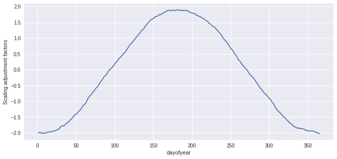
QM_mo.ds.af.plot()
[5]:
<matplotlib.collections.QuadMesh at 0x7feebf81f400>
Grouping
For basic time period grouping (months, day of year, season), passing a string to the methods needing it is sufficient. Most methods acting on grouped data also accept a window int argument to pad the groups with data from adjacent ones. Units of window are the sampling frequency of the main grouping dimension (usually time). For more complex grouping, or simply for clarity, one can pass a xclim.sdba.base.Grouper directly.
Example here with another, simpler, adjustment method. Here we want sim to be scaled so that its mean fits the one of ref. Scaling factors are to be computed separately for each day of the year, but including 15 days on either side of the day. This means that the factor for the 1st of May is computed including all values from the 16th of April to the 15th of May (of all years).
[6]:
group = sdba.Grouper("time.dayofyear", window=31)
QM_doy = sdba.Scaling.train(ref, hist, group=group, kind="+")
scen = QM_doy.adjust(sim)

ref.groupby("time.dayofyear").mean().plot(label="Reference")
hist.groupby("time.dayofyear").mean().plot(label="Model - biased")
scen.sel(time=slice("2000", "2015")).groupby("time.dayofyear").mean().plot(
    label="Model - adjusted - 2000-15", linestyle="--"
)
scen.sel(time=slice("2015", "2030")).groupby("time.dayofyear").mean().plot(
    label="Model - adjusted - 2015-30", linestyle="--"
)
plt.legend()
[6]:
<matplotlib.legend.Legend at 0x7feebf282f10>
[7]:
sim
[7]:
<xarray.DataArray (time: 11315)>
array([255.645648, 256.959683, 255.664977, ..., 260.275836, 259.490862,
       259.96272 ])
Coordinates:
  * time     (time) object 2000-01-01 00:00:00 ... 2030-12-31 00:00:00
Attributes:
units: K[8]:
QM_doy.ds.af.plot()
[8]:
[<matplotlib.lines.Line2D at 0x7feebec84dc0>]
Modular approach
The sdba module adopts a modular approach instead of implementing published and named methods directly. A generic bias adjustment process is laid out as follows:
preprocessing on
ref,histandsim(using methods inxclim.sdba.processingorxclim.sdba.detrending)creating and training the adjustment object
Adj = Adjustment.train(obs, hist, **kwargs)(fromxclim.sdba.adjustment)adjustment
scen = Adj.adjust(sim, **kwargs)post-processing on
scen(for example: re-trending)
The train-adjust approach allows to inspect the trained adjustment object. The training information is stored in the underlying Adj.ds dataset and often has a af variable with the adjustment factors. Its layout and the other available variables vary between the different algorithm, refer to their part of the API docs.
For heavy processing, this separation allows the computation and writing to disk of the training dataset before performing the adjustment(s). See the advanced notebook.
Parameters needed by the training and the adjustment are saved to the Adj.ds dataset as a adj_params attribute. Other parameters, those only needed by the adjustment are passed in the adjust call and written to the history attribute in the output scenario dataarray.
First example : pr and frequency adaptation
The next example generates fake precipitation data and adjusts the sim timeseries but also adds a step where the dry-day frequency of hist is adapted so that is fits the one of ref. This ensures well-behaved adjustment factors for the smaller quantiles. Note also that we are passing kind='*' to use the multiplicative mode. Adjustment factors will be multiplied/divided instead of being added/substracted.
[9]:
vals = np.random.randint(0, 1000, size=(t.size,)) / 100
vals_ref = (4 ** np.where(vals < 9, vals / 100, vals)) / 3e6
vals_sim = (
(1 + 0.1 * np.random.random_sample((t.size,)))
* (4 ** np.where(vals < 9.5, vals / 100, vals))
/ 3e6
)
pr_ref = xr.DataArray(
vals_ref, coords={"time": t}, dims=("time",), attrs={"units": "mm/day"}
)
pr_ref = pr_ref.sel(time=slice("2000", "2015"))
pr_sim = xr.DataArray(
vals_sim, coords={"time": t}, dims=("time",), attrs={"units": "mm/day"}
)
pr_hist = pr_sim.sel(time=slice("2000", "2015"))
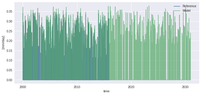
pr_ref.plot(alpha=0.9, label="Reference")
pr_sim.plot(alpha=0.7, label="Model")
plt.legend()
[9]:
<matplotlib.legend.Legend at 0x7feebf3e6d60>
[10]:
# 1st try without adapt_freq
QM = sdba.EmpiricalQuantileMapping.train(
pr_ref, pr_hist, nquantiles=15, kind="*", group="time"
)
scen = QM.adjust(pr_sim)
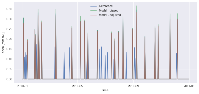
pr_ref.sel(time="2010").plot(alpha=0.9, label="Reference")
pr_hist.sel(time="2010").plot(alpha=0.7, label="Model - biased")
scen.sel(time="2010").plot(alpha=0.6, label="Model - adjusted")
plt.legend()
[10]:
<matplotlib.legend.Legend at 0x7feebecd5250>

In the figure above, scen has small peaks where sim is 0. This problem originates from the fact that there are more “dry days” (days with almost no precipitation) in hist than in ref. The next example works around the problem using frequency-adaptation, as described in Themeßl et al. (2010).
[11]:
# 2nd try with adapt_freq
sim_ad, pth, dP0 = sdba.processing.adapt_freq(
    pr_ref, pr_sim, thresh="0.05 mm d-1", group="time"
)
QM_ad = sdba.EmpiricalQuantileMapping.train(
    pr_ref, sim_ad, nquantiles=15, kind="*", group="time"
)
scen_ad = QM_ad.adjust(pr_sim)

pr_ref.sel(time="2010").plot(alpha=0.9, label="Reference")
pr_sim.sel(time="2010").plot(alpha=0.7, label="Model - biased")
scen_ad.sel(time="2010").plot(alpha=0.6, label="Model - adjusted")
plt.legend()
[11]:
<matplotlib.legend.Legend at 0x7feebba10d00>
Second example: tas and detrending
The next example reuses the fake temperature timeseries generated at the beginning and applies the same QM adjustment method. However, for a better adjustment, we will scale sim to ref and then detrend the series, assuming the trend is linear. When sim (or sim_scl) is detrended, its values are now anomalies, so we need to normalize ref and hist so we can compare similar values.
This process is detailed here to show how the sdba module should be used in custom adjustment processes, but this specific method also exists as sdba.DetrendedQuantileMapping and is based on Cannon et al. 2015. However, DetrendedQuantileMapping normalizes over a time.dayofyear group, regardless of what is passed in the group argument. As done here, it is anyway recommended to use dayofyear groups when normalizing, especially for
variables with strong seasonal variations.
[12]:
doy_win31 = sdba.Grouper("time.dayofyear", window=15)
Sca = sdba.Scaling.train(ref, hist, group=doy_win31, kind="+")
sim_scl = Sca.adjust(sim)
detrender = sdba.detrending.PolyDetrend(degree=1, group="time.dayofyear", kind="+")
sim_fit = detrender.fit(sim_scl)
sim_detrended = sim_fit.detrend(sim_scl)
ref_n, _ = sdba.processing.normalize(ref, group=doy_win31, kind="+")
hist_n, _ = sdba.processing.normalize(hist, group=doy_win31, kind="+")
QM = sdba.EmpiricalQuantileMapping.train(
ref_n, hist_n, nquantiles=15, group="time.month", kind="+"
)
scen_detrended = QM.adjust(sim_detrended, extrapolation="constant", interp="nearest")
scen = sim_fit.retrend(scen_detrended)
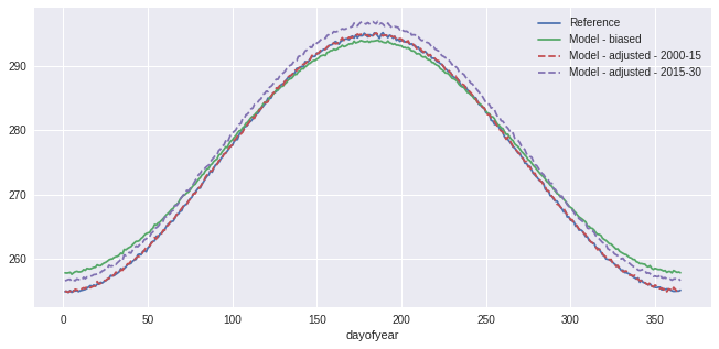
ref.groupby("time.dayofyear").mean().plot(label="Reference")
sim.groupby("time.dayofyear").mean().plot(label="Model - biased")
scen.sel(time=slice("2000", "2015")).groupby("time.dayofyear").mean().plot(
label="Model - adjusted - 2000-15", linestyle="--"
)
scen.sel(time=slice("2015", "2030")).groupby("time.dayofyear").mean().plot(
label="Model - adjusted - 2015-30", linestyle="--"
)
plt.legend()
[12]:
<matplotlib.legend.Legend at 0x7feebecb8cd0>
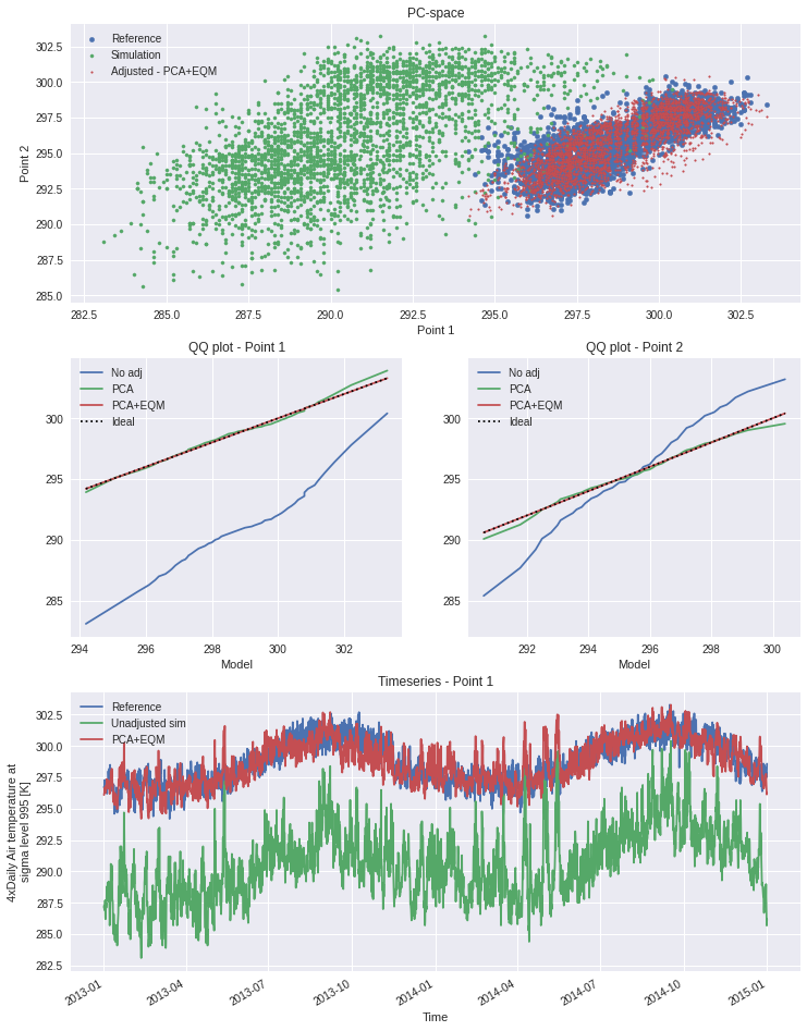
Third example : Multi-method protocol - Hnilica et al. 2017
In their paper of 2017, Hnilica, Hanel and Puš present a bias-adjustment method based on the principles of Principal Components Analysis. The idea is simple : use principal components to define coordinates on the reference and on the simulation and then transform the simulation data from the latter to the former. Spatial correlation can thus be conserved by taking different points as the dimensions of the transform space. The method was demonstrated in the article by bias-adjusting precipitation over different drainage basins.
The same method could be used for multivariate adjustment. The principle would be the same, concatening the different variables into a single dataset along a new dimension. An example is given in the advanced notebook.
Here we show how the modularity of xclim.sdba can be used to construct a quite complex adjustment protocol involving two adjustment methods : quantile mapping and principal components. Evidently, as this example uses only 2 years of data, it is not complete. It is meant to show how the adjustment functions and how the API can be used.
[13]:
# We are using xarray's "air_temperature" dataset
ds = xr.tutorial.open_dataset("air_temperature")
[14]:
# To get an exagerated example we select different points
# here "lon" will be our dimension of two "spatially correlated" points
reft = ds.air.isel(lat=21, lon=[40, 52]).drop_vars(["lon", "lat"])
simt = ds.air.isel(lat=18, lon=[17, 35]).drop_vars(["lon", "lat"])

# Principal Components Adj, no grouping and use "lon" as the space dimensions
PCA = sdba.PrincipalComponents.train(reft, simt, group="time", crd_dim="lon")
scen1 = PCA.adjust(simt)

# QM, no grouping, 20 quantiles and additive adjustment
EQM = sdba.EmpiricalQuantileMapping.train(
    reft, scen1, group="time", nquantiles=50, kind="+"
)
scen2 = EQM.adjust(scen1)
[15]:
# some Analysis figures
fig = plt.figure(figsize=(12, 16))
gs = plt.matplotlib.gridspec.GridSpec(3, 2, fig)

axPCA = plt.subplot(gs[0, :])
axPCA.scatter(reft.isel(lon=0), reft.isel(lon=1), s=20, label="Reference")
axPCA.scatter(simt.isel(lon=0), simt.isel(lon=1), s=10, label="Simulation")
axPCA.scatter(scen2.isel(lon=0), scen2.isel(lon=1), s=3, label="Adjusted - PCA+EQM")
axPCA.set_xlabel("Point 1")
axPCA.set_ylabel("Point 2")
axPCA.set_title("PC-space")
axPCA.legend()

refQ = reft.quantile(EQM.ds.quantiles, dim="time")
simQ = simt.quantile(EQM.ds.quantiles, dim="time")
scen1Q = scen1.quantile(EQM.ds.quantiles, dim="time")
scen2Q = scen2.quantile(EQM.ds.quantiles, dim="time")
for i in range(2):
    if i == 0:
        axQM = plt.subplot(gs[1, 0])
    else:
        axQM = plt.subplot(gs[1, 1], sharey=axQM)
    axQM.plot(refQ.isel(lon=i), simQ.isel(lon=i), label="No adj")
    axQM.plot(refQ.isel(lon=i), scen1Q.isel(lon=i), label="PCA")
    axQM.plot(refQ.isel(lon=i), scen2Q.isel(lon=i), label="PCA+EQM")
    axQM.plot(
        refQ.isel(lon=i), refQ.isel(lon=i), color="k", linestyle=":", label="Ideal"
    )
    axQM.set_title(f"QQ plot - Point {i + 1}")
    axQM.set_xlabel("Reference")
    axQM.set_xlabel("Model")
    axQM.legend()

axT = plt.subplot(gs[2, :])
reft.isel(lon=0).plot(ax=axT, label="Reference")
simt.isel(lon=0).plot(ax=axT, label="Unadjusted sim")
# scen1.isel(lon=0).plot(ax=axT, label='PCA only')
scen2.isel(lon=0).plot(ax=axT, label="PCA+EQM")
axT.legend()
axT.set_title("Timeseries - Point 1")
[15]:
Text(0.5, 1.0, 'Timeseries - Point 1')
Fourth example : Multivariate bias-adjustment with multiple steps - Cannon 2018
This section replicates the “MBCn” algorithm described by Cannon (2018). The method relies on some univariate algorithm, an adaption of the N-pdf transform of Pitié et al. (2005) and a final reordering step.
In the following, we use the AHCCD and CanESM2 data are reference and simulation and we correct both pr and tasmax together.
[16]:
from xclim.core.units import convert_units_to
from xclim.testing import open_dataset

dref = open_dataset(
    "sdba/ahccd_1950-2013.nc", chunks={"location": 1}, drop_variables=["lat", "lon"]
).sel(time=slice("1981", "2010"))
dref = dref.assign(
    tasmax=convert_units_to(dref.tasmax, "K"),
    pr=convert_units_to(dref.pr, "kg m-2 s-1"),
)
dsim = open_dataset(
    "sdba/CanESM2_1950-2100.nc", chunks={"location": 1}, drop_variables=["lat", "lon"]
)

dhist = dsim.sel(time=slice("1981", "2010"))
dsim = dsim.sel(time=slice("2041", "2070"))
dref
[16]:
<xarray.Dataset>
Dimensions:   (location: 3, time: 10950)
Coordinates:
  * time      (time) object 1981-01-01 00:00:00 ... 2010-12-31 00:00:00
  * location  (location) object 'Vancouver' 'Kugluktuk' 'Amos'
Data variables:
    tasmax    (location, time) float32 dask.array<chunksize=(1, 10950), meta=np.ndarray>
    pr        (location, time) float32 dask.array<chunksize=(1, 10950), meta=np.ndarray>
Attributes:
    title:        Test dataset for xclim.sdba - observed data
    description:  Extraced from homogenized observation data (AHCCD).'Vancouv...
    comment:      'Vancouver' has tasmax from station 1108380 and pr from 110...
    history:      2021-04-23T13:30:00 Extracted from AHCCD gen2 and gen3 data.
conventions: CF-1.8Perform an initial univariate adjustment.
[17]:
# additive for tasmax
QDMtx = sdba.QuantileDeltaMapping.train(
    dref.tasmax, dhist.tasmax, nquantiles=20, kind="+", group="time"
)
# Adjust both hist and sim, we'll feed both to the Npdf transform.
scenh_tx = QDMtx.adjust(dhist.tasmax)
scens_tx = QDMtx.adjust(dsim.tasmax)

# remove == 0 values in pr:
dref["pr"] = sdba.processing.jitter_under_thresh(dref.pr, "0.01 mm d-1")
dhist["pr"] = sdba.processing.jitter_under_thresh(dhist.pr, "0.01 mm d-1")
dsim["pr"] = sdba.processing.jitter_under_thresh(dsim.pr, "0.01 mm d-1")

# multiplicative for pr
QDMpr = sdba.QuantileDeltaMapping.train(
    dref.pr, dhist.pr, nquantiles=20, kind="*", group="time"
)
# Adjust both hist and sim, we'll feed both to the Npdf transform.
scenh_pr = QDMpr.adjust(dhist.pr)
scens_pr = QDMpr.adjust(dsim.pr)

scenh = xr.Dataset(dict(tasmax=scenh_tx, pr=scenh_pr))
scens = xr.Dataset(dict(tasmax=scens_tx, pr=scens_pr))
Stack the variables to multivariate arrays and standardize them
The standardization process ensure the mean and standard deviation of each column (variable) is 0 and 1 respectively.
hist and sim are standardized together so the two series are coherent. We keep the mean and standard deviation to be reused when we build the result.
[18]:
# Stack the variables (tasmax and pr)
ref = sdba.processing.stack_variables(dref)
scenh = sdba.processing.stack_variables(scenh)
scens = sdba.processing.stack_variables(scens)

# Standardize
ref, _, _ = sdba.processing.standardize(ref)

allsim, savg, sstd = sdba.processing.standardize(xr.concat((scenh, scens), "time"))
hist = allsim.sel(time=scenh.time)
sim = allsim.sel(time=scens.time)
Perform the N-dimensional probability density function transform
The NpdfTransform will iteratively randomly rotate our arrays in the “variables” space and apply the univariate adjustment before rotating it back. In Cannon (2018) and Pitié et al. (2005), it can be seen that the source array’s joint distribution converges toward the target’s joint distribution when a large number of iterations is done.
[19]:
from xclim import set_options

# See the advanced notebook for details on how this option work
with set_options(sdba_extra_output=True):
    out = sdba.adjustment.NpdfTransform.adjust(
        ref,
        hist,
        sim,
        base=sdba.QuantileDeltaMapping,  # Use QDM as the univariate adjustment.
        base_kws={"nquantiles": 20, "group": "time"},
        n_iter=20,  # perform 20 iteration
        n_escore=1000,  # only send 1000 points to the escore metric (it is realy slow)
    )

scenh = out.scenh.rename(time_hist="time")  # Bias-adjusted historical period
scens = out.scen  # Bias-adjusted future period
extra = out.drop_vars(["scenh", "scen"])

# Un-standardize (add the mean and the std back)
scenh = sdba.processing.unstandardize(scenh, savg, sstd)
scens = sdba.processing.unstandardize(scens, savg, sstd)
Restoring the trend
The NpdfT has given us new “hist” and “sim” arrays with a correct rank structure. However, the trend is lost in this process. We reorder the result of the initial adjustment according to the rank structure of the NpdfT outputs to get our final bias-adjusted series.
sdba.processing.reordering : ‘ref’ the argument that provides the order, ‘sim’ is the argument to reorder.
[20]:
scenh = sdba.processing.reordering(hist, scenh, group="time")
scens = sdba.processing.reordering(sim, scens, group="time")
[21]:
scenh = sdba.processing.unstack_variables(scenh)
scens = sdba.processing.unstack_variables(scens)
There we are!
Let’s trigger all the computations. Here we write the data to disk and use compute=False in order to trigger the whole computation tree only once. There seems to be no way in xarray to do the same with a load call.
[22]:
from dask import compute
from dask.diagnostics import ProgressBar

tasks = [
    scenh.isel(location=2).to_netcdf("mbcn_scen_hist_loc2.nc", compute=False),
    scens.isel(location=2).to_netcdf("mbcn_scen_sim_loc2.nc", compute=False),
    extra.escores.isel(location=2)
    .to_dataset()
    .to_netcdf("mbcn_escores_loc2.nc", compute=False),
]

with ProgressBar():
    compute(tasks)
[########################################] | 100% Completed | 1min 8.9s
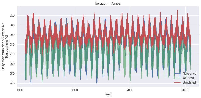
Let’s compare the series and look at the distance scores to see how well the Npdf transform has converged.
[23]:
scenh = xr.open_dataset("mbcn_scen_hist_loc2.nc")

fig, ax = plt.subplots()

dref.isel(location=2).tasmax.plot(ax=ax, label="Reference")
scenh.tasmax.plot(ax=ax, label="Adjusted", alpha=0.65)
dhist.isel(location=2).tasmax.plot(ax=ax, label="Simulated")

ax.legend()
[23]:
<matplotlib.legend.Legend at 0x7feebb95c370>
[24]:
escores = xr.open_dataarray("mbcn_escores_loc2.nc")
diff_escore = escores.differentiate("iterations")
diff_escore.plot()
plt.title("Difference of the subsequent e-scores.")
plt.ylabel("E-scores difference")
[24]:
Text(0, 0.5, 'E-scores difference')
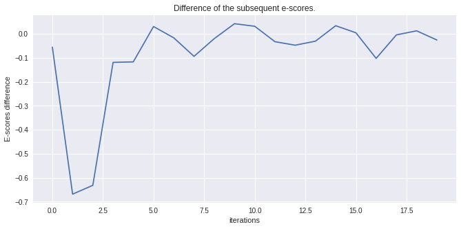
[25]:
diff_escore
[25]:
<xarray.DataArray 'escores' (iterations: 20)>
array([-0.0550046 , -0.6683734 , -0.63164103, -0.11868951, -0.11651939,
        0.03095996, -0.01624674, -0.09347305, -0.01951635,  0.04276526,
        0.03204501, -0.03230542, -0.04691735, -0.03019321,  0.03433082,
        0.00491887, -0.10195085, -0.00387722,  0.013035  , -0.02523094],
      dtype=float32)
Coordinates:
  * iterations  (iterations) int64 0 1 2 3 4 5 6 7 8 ... 12 13 14 15 16 17 18 19
location <U4 'Amos'The tutorial continues in the advanced notebook with more on optimization with dask, other fancier detrending algorithms and an example pipeline for heavy processing.